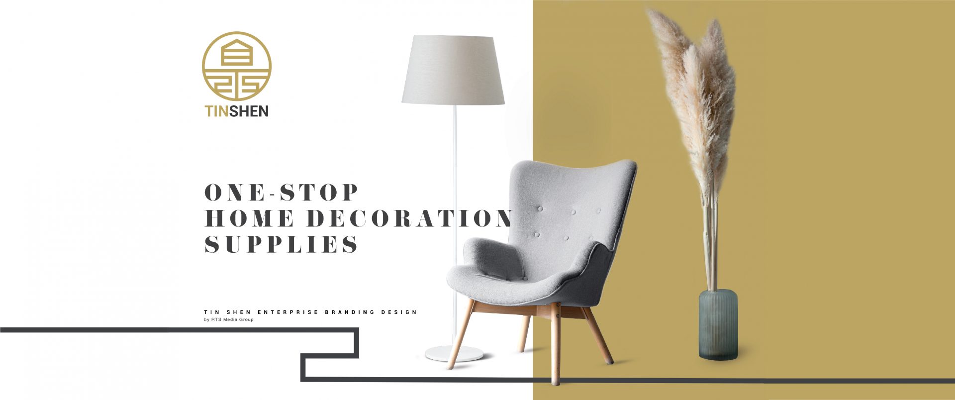
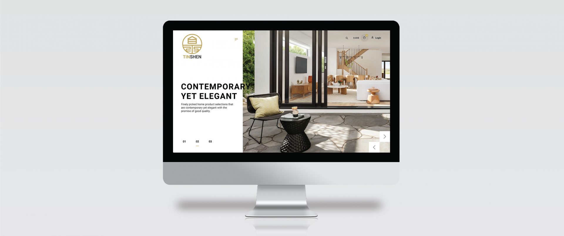
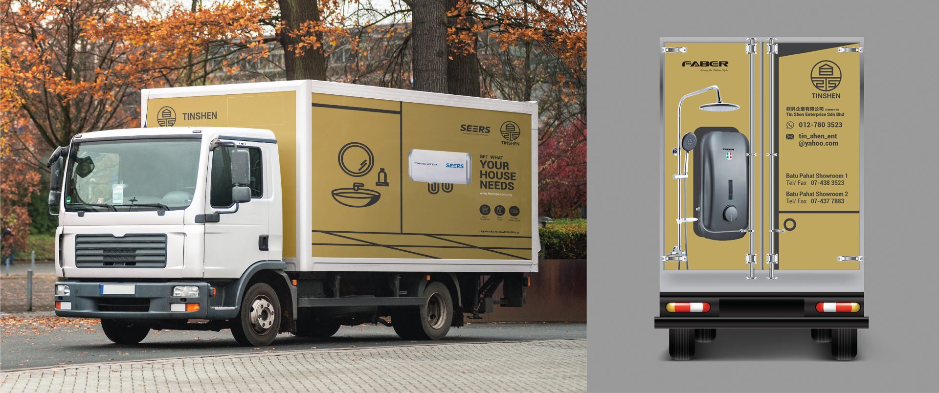
In 2012, Tin Shen Enterprise Sdn. Bhd. established a multi-brand operating as one of the home comprehensive store and provide professional services. In order to allow customers to purchase the necessary supplies and satisfaction our consumer needs. Tin Shen Enterprise Sdn. Bhd. sells a wide range of products and they are all relatively well-known brands. Our company takes pride in their finely picked home product selections that are contemporary yet elegant with the promise of good quality. The products are coming from Europe, China and Malaysia. Now on, Tin Shen Enterprise Sdn. Bhd. has expanded its business into the lighting industry and added lighting product display to satisfaction our consumer needs.
Logo Rationale
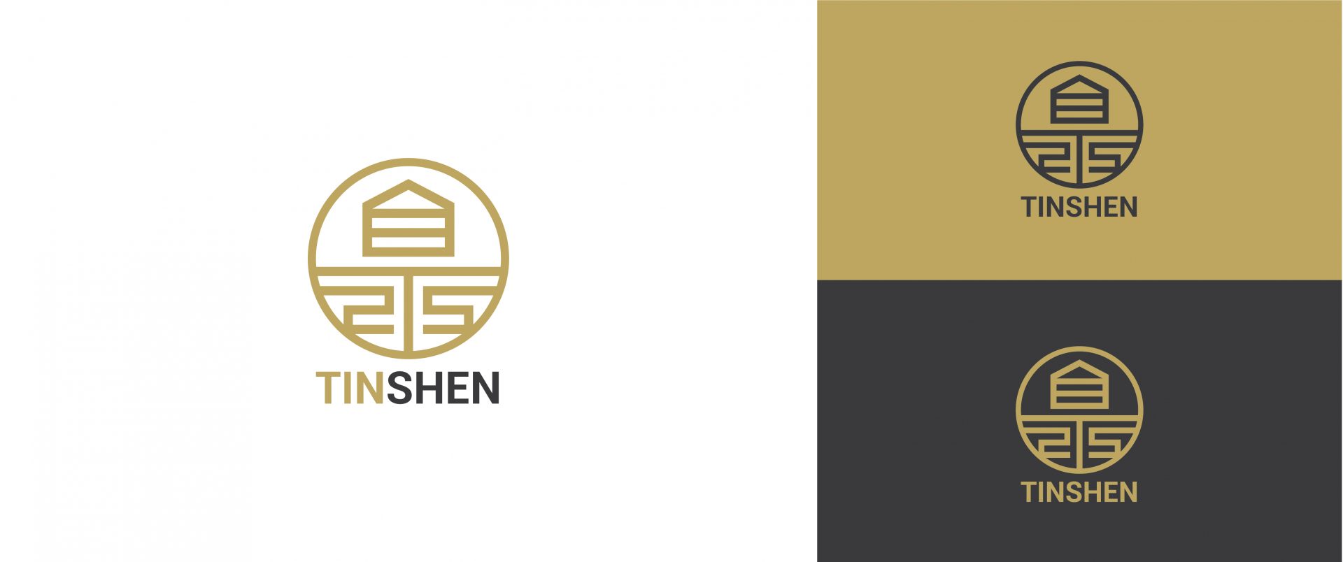
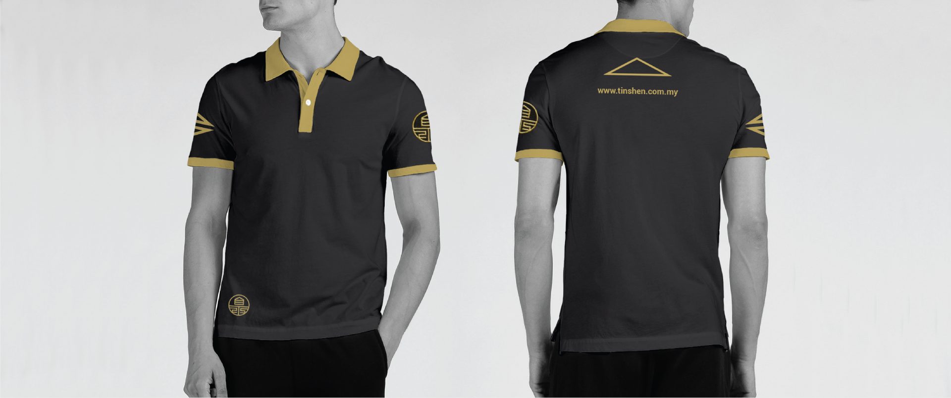
Tin Shen Enterprise Sdn. Bhd. logo design uses the initial fuse of Chinese and English words to combine “鼎” and “TS”, and then uses abstract and geometric styles to present the uniqueness of the logo. The overall shape of the logo is also a Chinese-style seal. It represents the authority and quality assurance of Tin Shen Enterprise Sdn. Bhd. Other than that, the shape of a house is hidden in the logo, which means Tin Shen Enterprise Sdn. Bhd. is the first choice for home comprehensive stores.
The designer used classic gold with dark grey as the main colour. This colour shows an atmosphere of stability, wisdom, wealth, calmness and elegance, which also symbolizes the value and status of Tin Shen Enterprise Sdn. Bhd. in the market.
Client:
Tinshen
Services:
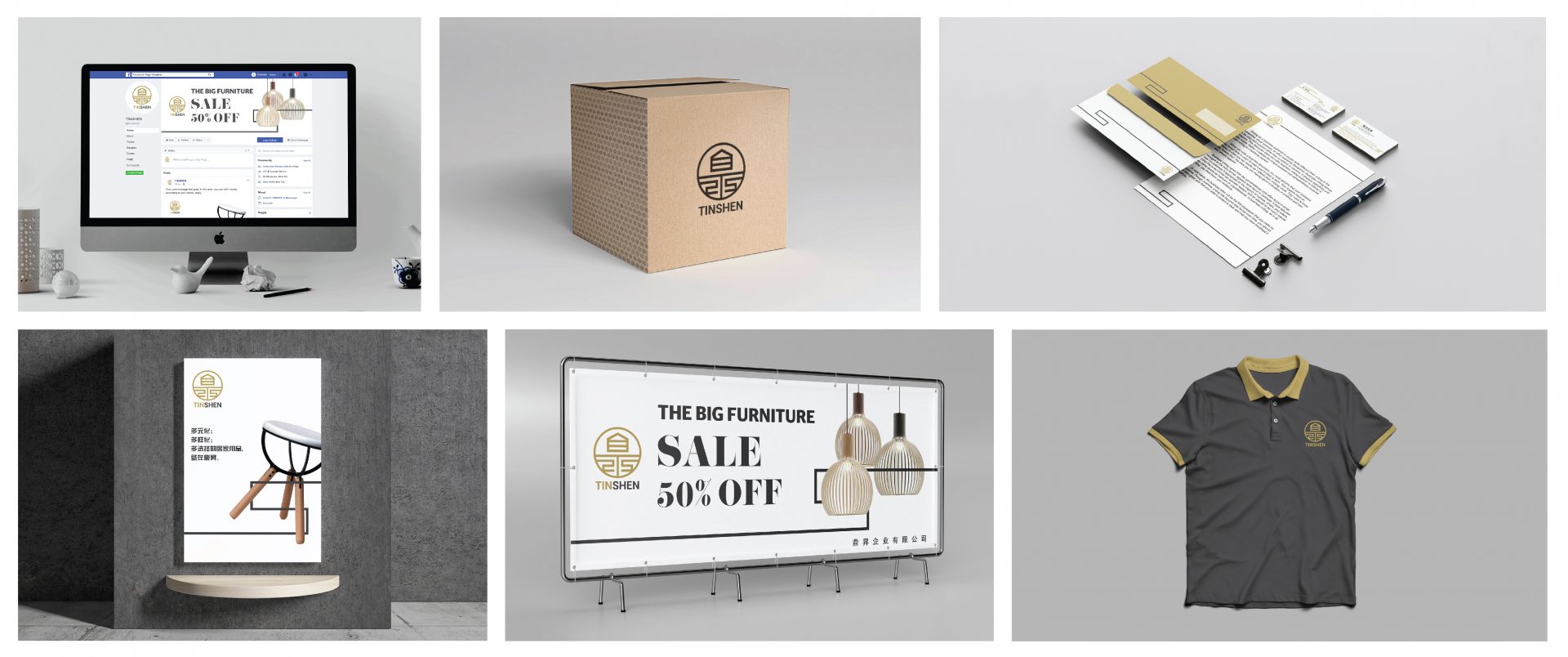
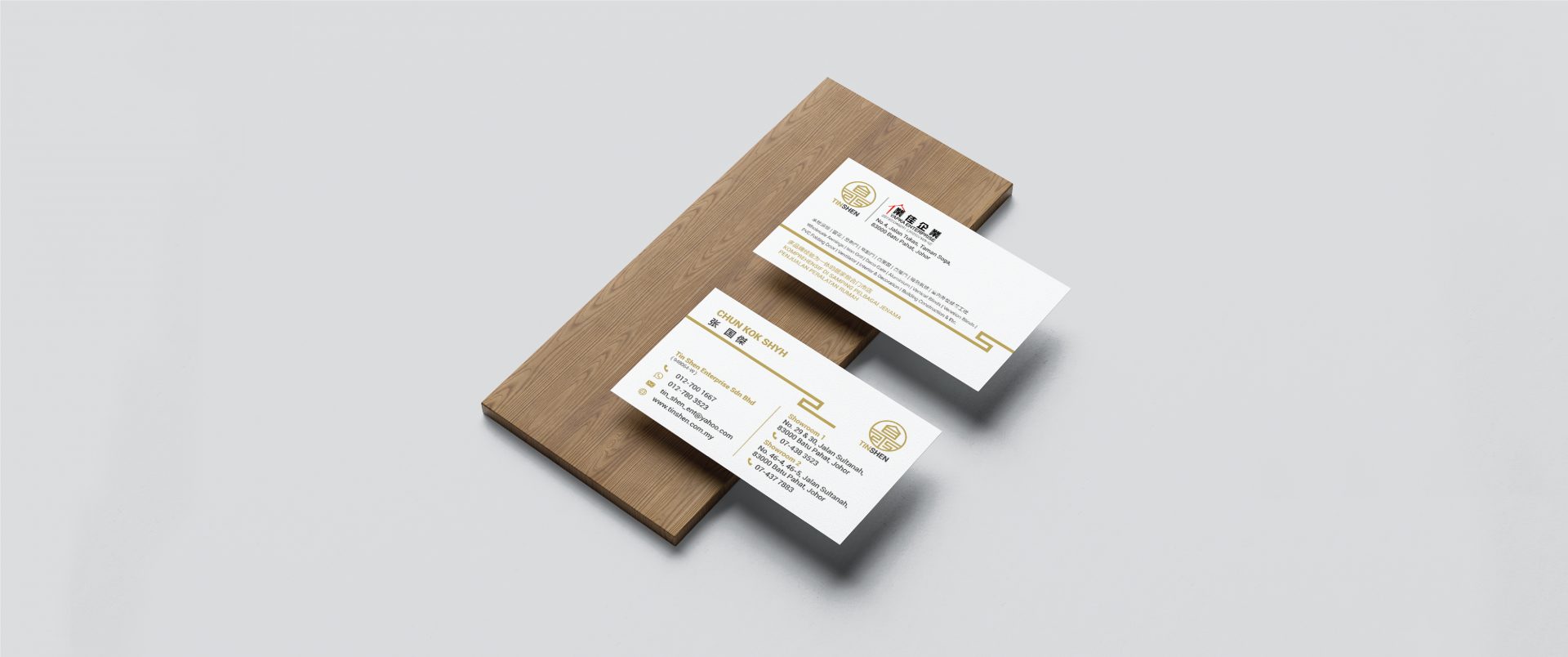
Brand Identity / Brand design , Web Ecommerce , Trademark Registered , Brand Name & Tagline , Printing